Plotting the Data
There are several possibilities to plot data. Most important is to include error bars for measured data. The plotting used here is based on matplotlib. In you analysis you typically plot raw data, or calculated values and error bars together with the result of a fit. If you analyze an experiment that involves counting of radom events, histogramming is frequently used together with its plotting capabilities. Some of the most frequently used functions included in LT/LT_Fit are described in the following.
Plot Columns of a Data File (pdfile)
Very often you would like to just quickly have a look at the
data in your file. For this the function dplot_exp() is very useful.
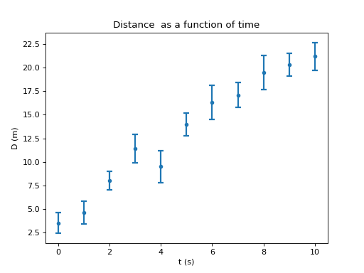
You can plot the values of the various columns in your datafile versus
each other. As an example I plot the time versus position of the data
in mf (my_exp_1.data) including the errors. Remember time was
called time, position was called dist and its error was called
d_err. You can always get the names of all the variables in you
pdfile object by doing :
In [21]: mf.show_keys()
In order or get a quick look at the data in data file you can use the following plotting command:
In [22]: B.dplot_exp(mf, 'time', 'dist','d_err')
You can even combine the loading of the file and the plotting into a single line (this is useful if you would like to have a quick look at data while you are taking them:
In [22]: B.dplot_exp(B.get_file('me_exp_1.data'), 'time', 'dist','d_err')
In this case we replace the mf by the call B.get_file('me_exp_1.data').
If you do not have errors or do not want to plot them just leave them off. If you cannot see a plot enter the command:
In [22]: show() # or
In [22]: B.pl.show()
This assures that the plot is shown and updated. It is especially important to issue this command in a script (see Python Scripts)
Example: clear a previous figure and plot some values in a data file with a one-line command:
In [22]: clf(); B.dplot_exp( B.get_file('my_exp_1.data'), 'time', 'dist','d_err'); show()
This is a simple way to take a quick look at data stored in a datafile.
Plotting Arrays of Data
Since you often have the data as a numpy.array() you need
be able to plot them. For experimental data with error bars you should use the function plot_exp().
This will be your most frequently used function to plot data.
As an example we use the arrays from the previous example namely t, dexp and
derr. To plot those you do:
In [25]: B.pl.clf()                              # clear the figure
In [26]: B.plot_exp(t, dexp, derr); B.pl.show()  # show the new plot wit error bars
If you have additional errors in the independent variable (x) you can add them with
the statement xerr = sigma_x where sigma_x stands for the array
containing your x errors.
To make a plot where you join the data points with a line you use the function plot_line().
This function is generally used when you plot a function representing a theoretical result or a fit result.
A simple example is show below:
In [26]: B.plot_line(t, dexp); B.pl.show() # join the data points with a line
Normally one does not join experimental data with lines, unless you really want to highlight a trend and/or has very many data points.
Note that this time the title and the labels are None. You can add the
labels as shown later. The plot looks the same as before. You
can leave off the errors if you leave off derr in the arguments to
B.plot_exp. There are many so-called keyword arguments to further
control the appearance. You can get more information on
plot_exp() or plot_line() and
even more on matplotlib.pyplot.plot() since this is the function
that the LT.plotting functions are based upon. You should also
familiarize yourself with how keywords are used.
Using a log-scale
If you need a log scale enter:
In [22]: B.pl.yscale('log'); show() # show() on the same line
This is also an example where two commands are given on one line. One
can enter several commands on one line if they are separated by a
;.
To switch back to a linear scale enter:
In [23]: B.pl.yscale('linear'); show()
Labeling the Plot
Every plot needs to be properly labeled in order that the viewer knows what is shown. At the least the x-axis and y-axis need labels but it is often good practice to add a title to the plot. You might also want to change the range of the x- or y-axis in order to show the viewer the important part of the plot with greater detail. This can be achieved by changing the axis limits. The commands for these tasks are shown below (make a not of these as you will use them often):
to change |
do this |
|---|---|
x-axis label |
B.pl.xlabel( ’ a new x axis label’ ) |
y-axis label |
B.pl.ylabel( ’ a new y axis label’ ) |
plot title |
B.pl.title(’A new Plot title’) |
x-axis limits |
B.pl.xlim ( (xmin, xmax ) ) |
y-axis limits |
B.pl.ylim( (ymin, ymax) ) |
Note that the two parenthesis are needed since the limits are entered as
so-called tuples. These are basically as sequence of objects (numbers,
strings etc.) which cannot be changed. If you enter the command
B.pl.xlim() you will get back the current limits. If you want to know
more about tuples have a look at the Python documentation.
Finally, below is the final plot including all the commands necessary:
Save the plot
You can save the plot as a pdf file by giving the command:
In [24]: B.pl.savefig('my_plod.pdf')
Note that all the commands that adjust the plot start with B.pl. The
reason is that the LT.box module itself imports the matplotlib
plotting module and gives it the name B.pl. Frequently (especially if you are using Spyder)
matplotlib.pyplot and numpy have already been
imported. However when you run a script (Python Scripts) you need to import them
explicitly and it is therefore a better practice to use B.pl in
front of the commands (assuming you did import LT.box as B) to get
used to it.
1D-Histograms
Histograms are typically used in counting experiments, especially in nuclear physics experiments. One experiment you do very early on is to count the number of decays from a radioactive source during a certain amount of time. This measurement is then repeated many times. I have simulated the result of such and experiment and the data are stored in the file ’counts.data’. To work with these data I first load them in the same way as I did before:
In [27]: mcf = B.get_file('counts.data') # get the file
To see what columns have been defined you do (as before)
In [28]: mcf.show_keys()
And the output should be something like
In [28]: mcf.show_keys()
['n', 'counts', 'indx']
Here n is the number of the measurement (the first one would be 0) and
counts is the number of counts you obtained in this experiment. The
additional variable indx is used internally and is not interesting to
you (DO NOT TOUCH IT!). To get an idea what the data look like, I
could just plot counts as a function of n. Since I want to plot the
data that are part of a pdfile object I will used the dplot_exp()
function.
In [29]: B.dplot_exp(mcf, 'n', 'counts')
You will notice that the data scatter around a value of 150. To do analyze them further we need to convert them to numpy arrays:
In [30]: ne = mcf['n']
In [31]: counts = mcf['counts']
Now let’s calculate the average. To do this you need a for loop
In [32]: N = 0              # set the counter to 0
In [33]: sum = 0.           # set the sum to 0
In [34]: for cc in counts:  # loop over all counts
   ....:    N += 1          # increment the counter
   ....:    sum += cc       # add the current value to the total sum
Close the loop with two returns. Now you you can get the average by doing
In [35]: N_av = sum/N # evaluate the average
This was a little programming. First I created a variable called N to
count the number of terms in the sum and, in the first statement (N =
0), I set it to 0. Then I did the same for another variable, called
sum. sum should contain the running sum of the values which is
carried out in a for loop (for cc in counts:). In the loop, cc
contains the current value of counts. There are two strange looking
lines. The first, N += 1 means: add 1 to the current value of N or
increment N by 1. The second does the same for the variable sum
but instead of adding 1 we add the current value of the counts stored in
cc. As a consequence at the end of the loop N contains the number of
measurements and sum the total sum of the values. To calculate the
average all I have to do is take the ratio of the two numbers and store
them in the variable N_av. This was done in the last line (N_av =
sum/N). To look at its value:
In [35]: N_av
Out[35]: 150.41499999999999
This was a small programming example. Since the average is such an important quantity this procedure has been built into numpy.
In [36]: np.average( counts )
Will give you the same result. There are many useful function defined
for numpy.array() ‘s. Here are just a few useful ones using counts as an example:
Function |
Returns |
|---|---|
counts.sum() |
the sum of all elements |
counts.mean() |
the mean (average) of all elements |
counts.var() |
the variance of all elements |
counts.min() |
the smallest value of the array |
counts.max() |
the larges value of the array |
Try them out !
When you create a histogram you want to count how often a certain
value occurs within certain limits. To do this there is a special
histogram object in LT.box called histo. The simplest way to use it is as
follows:
In [37]: hh = B.histo(counts)
It looks as if nothing has happened. But if all the work as already been completed. You can now make a plot of the histogram by doing
In [38]: hh.plot()
And you will get a (blue) graph that represents the frequency with
which certain counts values occur. There are other useful plotting commands, such as
hh.plot_exp() which will plot error bars associated with the bin contents.
Check the histogram documentation for more details.
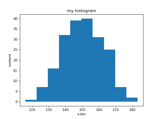
What you see is a relatively coarse representation of this
distribution since in its simples form histo
automatically determines the range of values that you provided. This
range is divided into 10 equally spaced regions, called bins centered
around a central value (bin_center) with a width called the bin_width. It
then goes through all the data in the array counts and checks in
which region (bin) each value falls. To each bin belongs a
counter that is incremented each time a values falls within the
associated region. The value of each counter is called the bin
content. The graph now shows the value of the bin content as a
function of the bin-center value. The width of each step
corresponds to the width of a bin. You have much more control on how
your histogram is setup. Lets re-define it and this time we give it a
range and also the number of bins. From the first graph we see that
most bin-content values of counts lie between 120 and 180. If we
want to get a count of how often a specific value occurs we need to
make the bin width equal to one as follows
In [39]: hh = B.histo(counts, range = (120., 180.), bins = 60)
This is another example of using keywords to control what an
object/function is doing. the range = (120., 180.) determines the
range of values accepted, where range is the keyword. The other
statement bins = 60, sets the number of bins to 60. In that way the
width of a bin is 1. Now plot the new histogram again.
In [40]: clf(); show()
In [41]: hh.plot(); show()
(Remember the first line clf() clears the figure). Now you have a much
better representation of the histogram:
The central values (bin-center), the bin-content (number of occurrences) and the
associated errors (bin-error) of each bin are can be accesses as follows:
In [42]: hh.bin_center (return)
Produces the the output:
In [43]: hh.bin_center

Out[43]:
array([ 120.5,  121.5,  122.5,  123.5,  124.5,  125.5,  126.5,  127.5,
        128.5,  129.5,  130.5,  131.5,  132.5,  133.5,  134.5,  135.5,
        136.5,  137.5,  138.5,  139.5,  140.5,  141.5,  142.5,  143.5,
        144.5,  145.5,  146.5,  147.5,  148.5,  149.5,  150.5,  151.5,
        152.5,  153.5,  154.5,  155.5,  156.5,  157.5,  158.5,  159.5,
        160.5,  161.5,  162.5,  163.5,  164.5,  165.5,  166.5,  167.5,
        168.5,  169.5,  170.5,  171.5,  172.5,  173.5,  174.5,  175.5,
        176.5,  177.5,  178.5,  179.5])
Below is a summary of the most important information stored in
histo. I use hh as the name for the histogram here by you can use
any other variable name when you create it:
variable |
meaning |
|---|---|
bin_center |
Central value of each bin. |
bin_content |
Content of each bin (the value of the counter) |
bin_error |
Error of the content of each bin |
bin_width |
Width of each bin |
title |
Histogram title. You can store the short description of the data (used in plotting). |
xlabel |
Description of the bin_center values (used in plotting). |
ylabel |
Description of the bin_content (used in plotting). |
And here the most important (member) functions:
Function |
Arguments and Results |
|---|---|
histo |
Create a histogram. There are several ways to create one depending on the arguments in histo here are the main possibilities:
|
plot |
Plot the histogram. There are several keywords that can be set to
control the plot. You can assign a minimal value |
sum |
Add the content of the histogram for the values ranging between (and
including) |
save |
Save the histogram to the file |
For more information see LT.box.histo.
2D-Histograms
If one is interested in analyzing correlations of data 2-dimensional histograms are frequently used. In this case one counts the number of occurrences of pairs of data. The 2D-histogram is setup as follows:
In [37]: hh2 = B.histo2d(x_vals, y_vals, bins = [15,25]) # create a 2D-histogram for the values x_vals, y_vals
                                                         # use 15 bins in the x-direction
                                                         # use 25 bins in the y-direction
Once the histogram is created you can plot it with the command:
In [38]: hh2.plot() # plot the 2d histogram
For more detailed information on 2D-histograms see LT.box.histo2d.